Statistics
See what your keyword list is actually catching — chart by chart.
Overview KPIs: total messages, accounts, chats, keywords
The top of the Statistics page shows four KPI cards aggregated across every account you own.
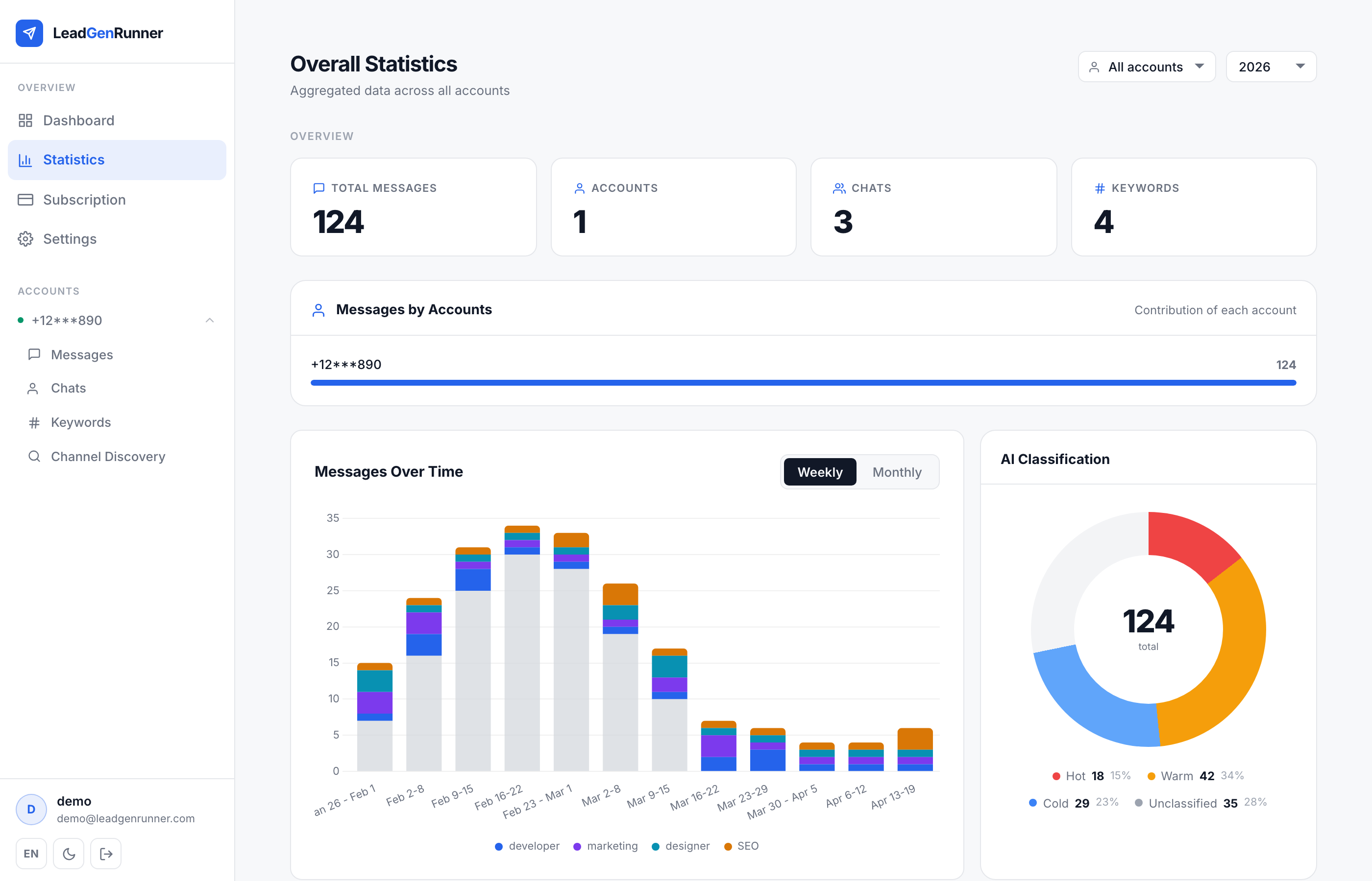
Timeline and AI classification donut
Weekly timeline on the left, AI classification donut on the right — the quickest way to see whether your leads are getting hotter or colder over time.
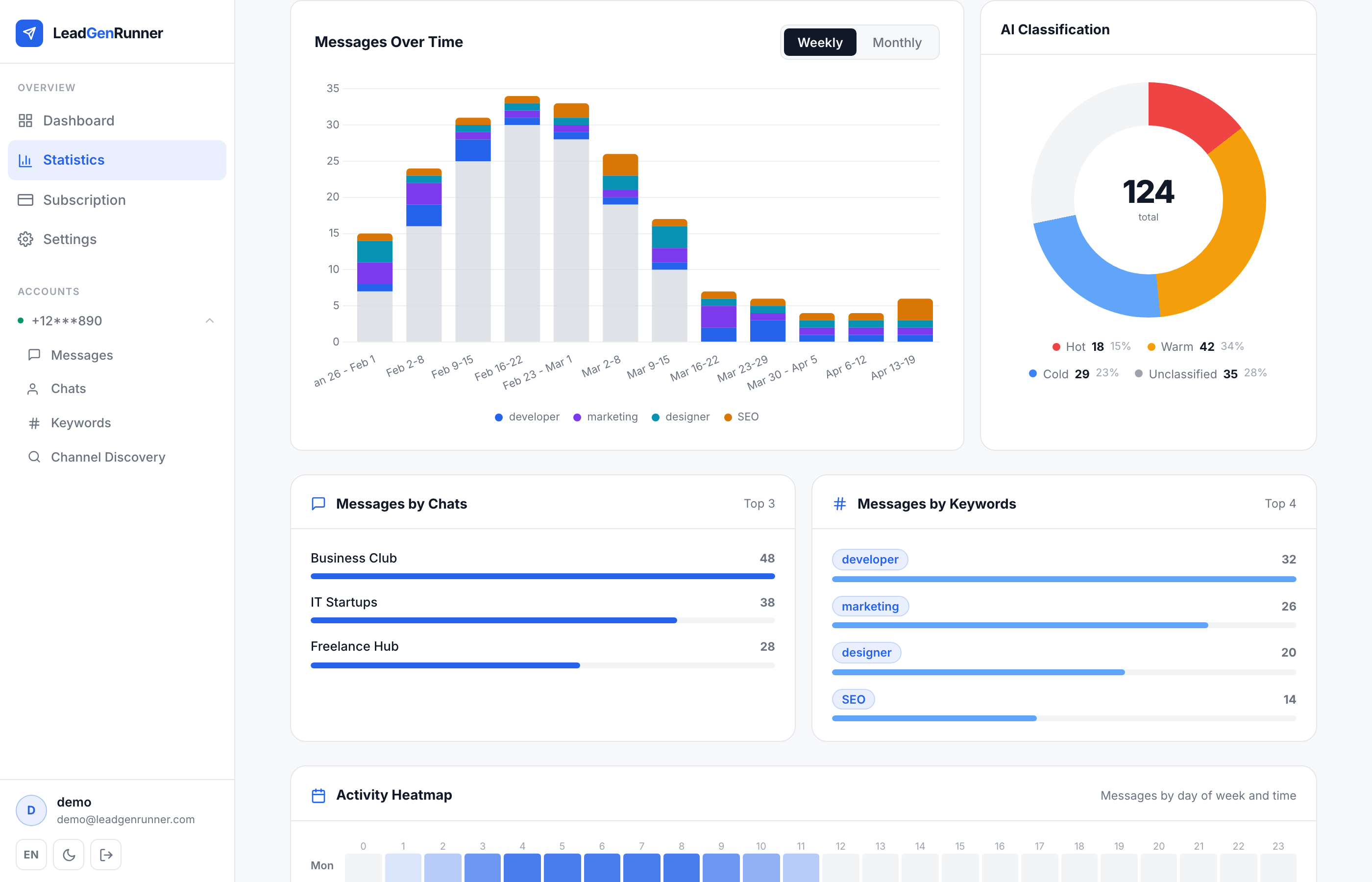
Messages by chat and by keyword
Horizontal bars tell you which chat sources and which keywords produce most of your matches — so you know where to add more sources and where to tighten your list.
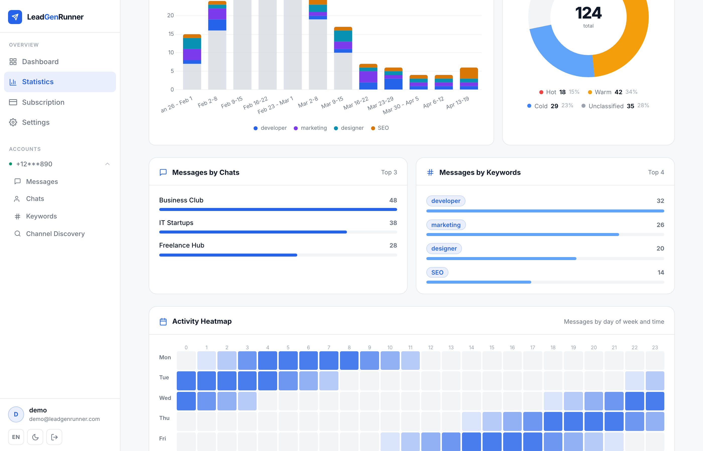
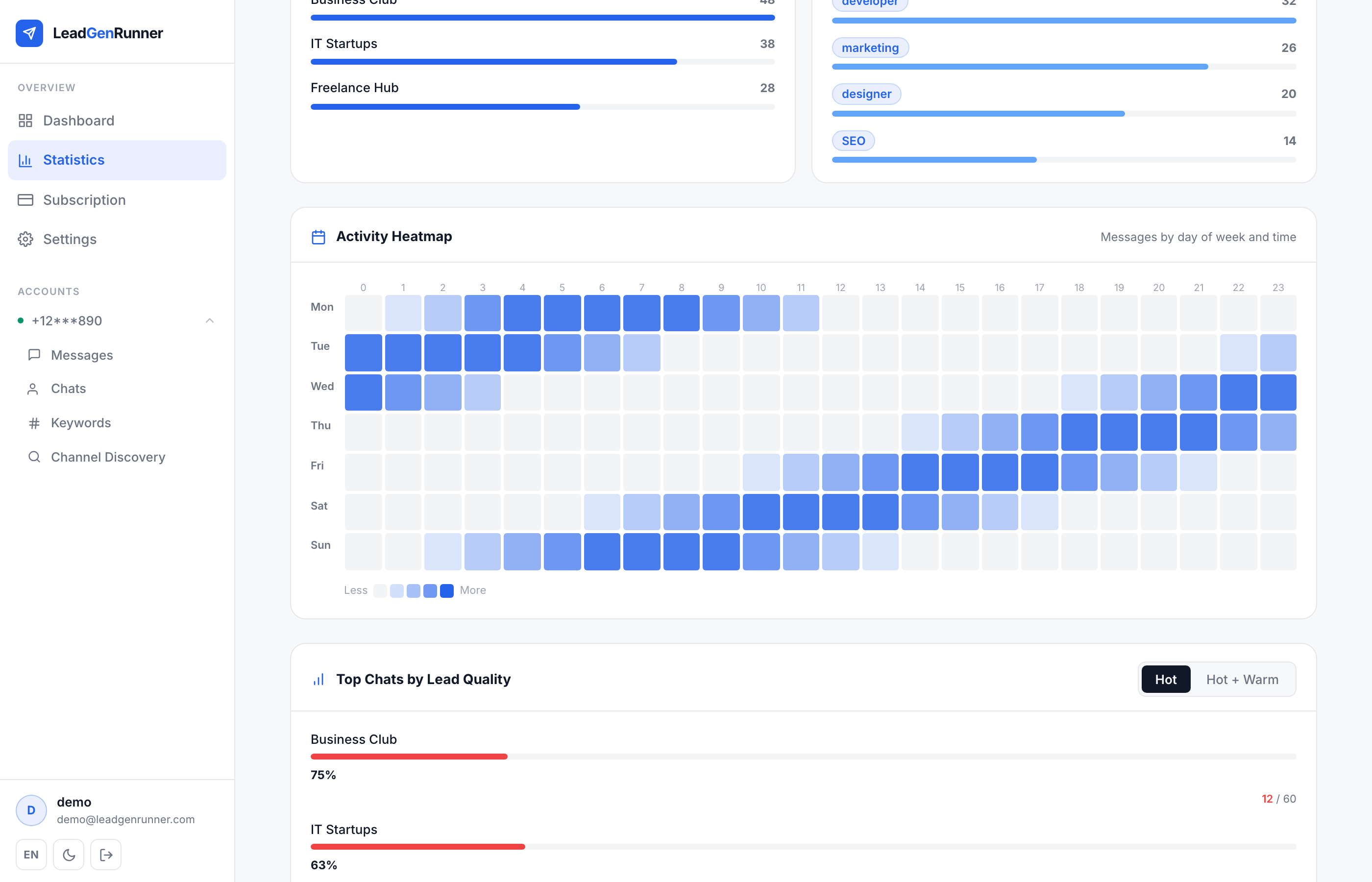
Activity heatmap — when your leads actually talk
A 7-day × 24-hour grid colouring every cell by how many matched messages landed at that weekday and hour — so you can spot the windows when your audience is most active and time your replies accordingly.
Drill down into a single account
Pick a specific account from the filter to switch the whole page into that account's view — same KPIs and charts, but scoped to one phone number.

Ready to try it yourself?
Start a free plan and see your first leads within minutes.
Start free